Some might scoff at the premium price for these dice, but it really truly is an issue of you get what you pay for. I own several sets at this point now, amongst them the steampunk and Deadlands which are both awesome and very usable. (you can head over to Eye of the Vortex to read my reviews of these two sets). When it comes to Q-Workshop dice, I can only use really one word to describe their style: intricate. Take a look at the picture here to the left. Even the plainest of the bunch, the runic clear gel die has a unique flair to it. Through the kindness of Q-Workshop, I have been provided three sets for your perusal today to revew: the Celtic, the Forest, and the Classic Elven Runic dice. Which one was my favorite? Keep reading to find out (and for TONS of pictures of pretty dice taken on the Gamer Wife's fancy shmancy new camera)!
The Three Factors
Generally speaking, I've identified three key factors in order to rate dice: the feel ("Is it satisfying to throw these things?"), aesthetic appeal ("How pretty is it?"), and readability ("Is that a nine or a six?").
The Feel
First off, there's a bit of a discrepancy between the Gamer Wife and myself on the physical feel. It's posible that I'm just too used to throwing these dice around the table and love the feel of them naturally, but the Gamer Wife thought these were a little on the light side. I think the two white sets are a bit lighter than the transparent Elven Runic set. That being said, I believe they all feel just about right. They're heavier than the free dice you get in collectible mini game starters, but not quite as heavy as the marbelized plastic dice you get from say, Crystal Caste or Games Workshop.
The Elven dice are obviously much smoother and more traditional in feel than the other two sets. Q-Workshop always tend to pack details etched into their dice, and generally speaking this creates a nice ridged and textured effect. Take a look at the Elven dice below in a close-up.
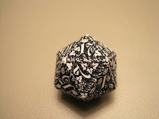
The Forest dice set literally made my jaw drop when I saw them for the first time. Part of it is the fact that I knew they'd feel unique in my hand. When I popped them open, I was not disappointed. Look below for the crazy amound of texture in this set.
I have to say that, out of the three sets, the Forest set really wins brings the competition hard for this category given just how textured it is. Seriously, how do they do that? It must be thousands of tiny little robot elves chipping away at the dice night and day. Regardless, I have to bow down to the Gamer Wife and agree that the Elven Runic set, give the type of plastic and weight to them, outshine the other two sets.
Aesthetic Appeal
Aesthetic Appeal is what makes you look at a die and go "holy crap,I need that." I usually experience this with every set of Q-Workshop dice I see, but the two white plastic sets really seemed to up the ante of aesthetic appeal the company can offer.
Of course a lot of times aesthetic appeal is tied into readability. When looking at Q-Workshop, these are the two things you really have to balance. I'm going to do my best to separate the two factors and look solely at pretty dice and judge these simply by their "wow" factors.
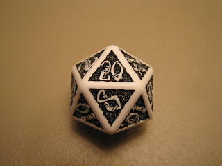
Let's be honest: while the Elven Runic set is pretty and perfectly servicable (not to mention perfect for a first dipping of the toe into the Q-Workshop pond), it can't really compete against the Forest and Celtic sets. Speaking of the Celtics, let's take a closer look at this set below.
But then we have to compare them to the even more insanely-intricate Forest dice set, and that just doesn't seem fair. I mentioned above that I own a lot of Q-Workshop dice (I'm up to 6 or 7 at this point), and the Forest set blows me away more than any other design. The dice look so much like an overgrown forest, it's freaky. The amount of seemingly-random (in a good way) designs covering every millimeter of these dice makes them look just unnatural (again, in a good way).
Look at that gorgeous 11. Check out all that leaf action! While I really like the Celtic set's look, the Forest set pulled away far ahead for pure aesthetic appeal.
Readability
Readability gets down to the brass tacks of dice - results. At their core, dice are just little randomizer tables that give us a random number when we throw a little kinetic energy at them. You can go online and gets apps for your phone and free dice roller websites to your heart's content, but when it comes down to it, all that fancy and flashy computer high-techery doesn't count for a thing when it comes to our little hunks of lovable, hobby-defining plastic.
We've come a long way since we first started to see anything outside of the d6. Back in the day your basic D&D set came with dice...and a little black crayon to fill in the numbers. There was even a special edition of D&D produced for prison inmates where, instead of dice, they were given cardboard cuts outs to draw from a hat to determine the result. You know, cause dice and crayons are dangerous.
We've come a long, long (loooong) way since those days, but our dice are still used the same was they were 30 years ago. We still tend to roll a d20 to find a number to add to our attack to see if we killed that group of kobolds with our ball lightning. The only place Q-Workshop tends not to shine quite as bright as other dice companies is in the readability category. Some may call this a design flaw and a deal breaker, but I believe this just makes your dice work uniquely for you - no one else will pick them up if they can't read the result!
The Forest set, my favorite looking of the three, is by far the most difficult to read. It took me more than 5 seconds (I think a reasonable amount of time to expect to be able to figure out a die result) to realize that the above d20 would yield you a 17. What makes the Forest dice so aesthetically pleasing - the uninterrupted and overwhelming forest designs - makes the numbers quite difficult to read.
Look at the Celtic d20! Remember when I mentioned above how much the white borders make the numbers just pop off the background? That's readability, and because of those fat whitelines, the Celtic set blows away the other two sets. I love how these dice are completely readable at the table (about a foot and a half away from your eye when they land) and only look better when you bring them in for a close-up and can see the designs.
Roll The Dice!
As always, I'm very impressed by these sets from Q-Workshop. They each have their strong points, and I can easily recommend the Elven Runic set as a great place to try out the dice offered by Q-Workshop. There's just really not a lot of competition out there that can bring it like the Q brings it. The Forest and Celtic setsreally seem to reach a new level of design even above previous Q-Workshop sets.
We're going to have some more coverage of Q-Workshop at Gencon, so make sure to stop back and check us out. Gencon also happens to be the best place to get a hands-on look at all the different dice they have to offer, so make sure to stop on by and say hello. Make sure to tell them I sent ya!


"There was even a special edition of D&D produced for prison inmates where, instead of dice, they were given cardboard cuts outs to draw from a hat to determine the result. You know, cause dice and crayons are dangerous."
ReplyDeleteMy first Basic D&D set (Holmes "Blue Book") had the "chits" for cutting up and drawing out of a cup. I got it while at band camp in '81 or '82 ('81, I think).
That's awesome Steven! I think what you're really trying to say is that band camp is just as dangerous as prison. :D
ReplyDeleteThanks so much for this detailed review. I have just as much of a dice obsession.
ReplyDelete